

Non-Profit Environmental Group ||
Usability Testing & User Research
The Sierra Club’s website has experienced tremendous growth over the past decade. It has become the go-to tool for its members, supporters and interested parties at large to search for activities listed by its 64 local chapters, to plan a trip or outing, or to read about current environmental and political activism. The site grew organically through add-ons of intra-sites, external sites, sub-navigation, sub sub-navigation, and an extensive footer navigation. This has led to inconsistencies throughout, leaving users confused or uncertain of whether they completed their tasks.
ROLE
As members of the UXDI Platypus Design Team at General Assembly, the DDE UX Collective, Daria Vander May, Dave Wexler, and myself, were asked to conduct in-depth data research of content structure, user flows and tasks of the Sierra Club’s website. The research was then synthesized to enter into a design phase with two design iterations. The design phase was conducted individually, and reflect my own design recommendation.
METHODS & TOOLS
A screener survey
5 one-on-one user interviews
Usability tests
A business model canvas was conducted to analyze the basic Sierra Club business structure.
A competitive matrix was drawn to identify key competitors.
A heuristics analysis utilizing the Abby1 method was done to identify overall philosophical qualities and principles of the website’s usability.
A mobile audit was done to identify consistencies and inconsistencies across web and mobile use.
A sitemap of the current website was drawn to identify the current content structure.
User and task flows of both the home page and internal pages were mapped out to identify key user navigation pathways.
Both an open card sorting and closed card sorting were performed with 5 users each, totaling 10 card sorting interviews with 10 different users.
OUTCOME
Be clear, be confident and don’t overthink it. The beauty of your story is that it’s going to continue to evolve and your site can evolve with it. Your goal should be to make it feel right for right now. Later will take care of itself. It always does.
Usability Testing
We conducted 5 one-on-one user interviews with the 5 individual users drawn from our screener survey to get usability test insights into basic user flow patterns, content recognition and navigation. We introduced each of the 4 task flows with a scenario the user would find him/herself in. The tasks were formulated to suit the Sierra Club’s archetype.
THE SIERRA CLUB ARCHETYPE
He or she wants to get politically involved and help the cause, however, their pain point is that they are cash-strapped.
Objective
We tested the users to determine metrics on how well a user can navigate basic functions on the Sierra Club’s website.
We asked users to complete 4 tasks and we compiled the users’ thoughts about the site and rating of difficulty to use.
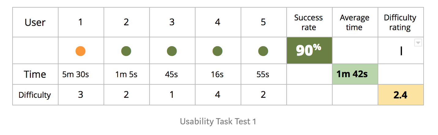
Usability Test Results — Illustrating two tasks, one that was done easily, and one where users failed to accomplish the task.
TASK 1
From the Sierra Club home page, find a nearby activity and tell us what you found.
Key Insights from Usability Testing
What users found interesting:
”The political endorsements is the most useful and interesting information for me. But it is also most difficult page to get to, which is disappointing.”
“It has a lot of information about different things that would be useful to me. I like to read up more on environmental issues.”
All users found the site to be difficult to navigate.
“It has a lot of information right upfront.”
“It seems more disorganized than what I’m used to.”
“It needs content organization, so I know where I am at.”
Competitive Matrix

Heuristics Analysis
This analysis is based on the Abby (Ref 2) method. We analyzed 10 attributes on the HOME page, the ABOUT page, the NEAR YOU page, the POLITICS & ELECTIONS page, and the ENVIRONMENTAL JUSTICE page. We selected these pages based on the tasks we tested in our Usability Testing process.

Key Insights
We found inconsistencies throughout:
Hero image not translating to the mobile view.
Primary nav bar is not integrated into mobile view.
Menu nav on the Environmental Justice page was more prominent
on the mobile version.Social media icons were positioned as a fixed footer in the mobile version, making it difficult to scroll to the bottom footer.
Chapter listings translated into a long scroll in the mobile app.
What worked well
Donate Now stayed consistent throughout on both web and mobile.
Content scrolling works well on the mobile version.
Mission Statement on the Environmental page translated consistently from web to mobile.
Site Map
It all begins with an idea. Maybe you want to launch a business. Maybe you want to turn a hobby into something more. Or maybe you have a creative project to share with the world. Whatever it is, the way you tell your story online can make all the difference.